

Google Fonts is one of the most popular choices for fitting your website with interesting and beautiful typography. There are a lot of really great fonts (with currently over 700 to choose from), but I definitely have some tried and true favorites that I reach for repeatedly. I’ve combined them into pairings below, but they really go great with a variety of other choices as well!
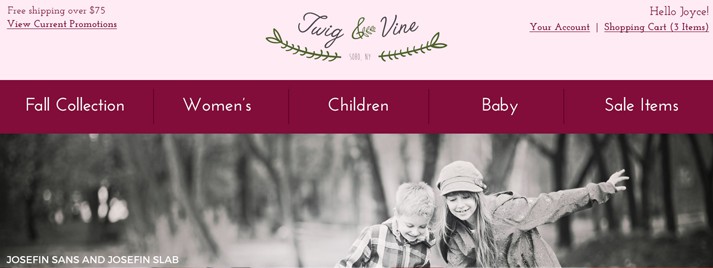
Josefin Sans and Josefin Slab
While these two aren’t always the easiest to use because their stroke weight is very light, I really like them. Crafted with some vintage 1920’s inspiration, Josefin Sans and Josefin Slab feature delicate, feminine characters with a short x-height in comparison to the font’s cap height (in layman’s terms, that really just means the lower-case letters are shorter than normal). They also have 10 different styles apiece, with thin, regular, italic and bold options. And I do really love slab serif fonts (Josefin Slab is only the first on this list).
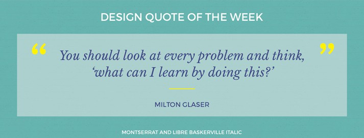
Montserrat and Libre Baskerville
If you are looking for a replacement for Gotham on the web, try Monserrat! The characters are really similar (go ahead, compare the R’s and you’ll see what I mean) and give the same modern, friendly feeling. I’m not sure I’ve seen Montserrat look bad, regardless of what it’s paired with!
Even though I don’t reach for more traditional serif fonts very much, one of my favorites has to be Libre Baskerville. As you could probably guess by it’s name, it had similarities to Baskerville and the other classical typefaces. I personally really love the italic version!
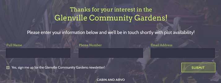
Cabin and Arvo
Cabin might be my current top favorite from Google Fonts. It has 8 different style options within it’s family, and it’s overall a very friendly and highly readable font. I love it as body copy or in headlines (although, Cabin Condensed is great for these as well).
Arvo is another beautiful slab serif. This one works better than Josefin Slab as body copy because of a thicker stroke, and definitely has a more modern feeling. I’ve even paired this font with sparing uses of a more traditional serif, and although hard to believe, it worked pretty well. (Bonus paring: Arvo and Montserrat)

Vollkorn and Lato
Lato is probably the most neutral sans serif on this list, and works great for body copy. Fun fact: this font’s name means ‘summer’ in Polish.
My last recommendation, for when you’re reaching for a serif, is Vollkorn. It feels lighter and more modern than some serifs, and like Lato, is fairly neutral in feeling and highly readable. Again, I love the italic version of the font, especially for headlines and titles.